


What if The Row had a beauty line?
How can I out-chic the chicest?

For this branding exercise, I thought I’d capitalize on another immensely popular brand; The Row. I thought I’d combine its popularity with my beauty expertise, and fantasize about The Row’s potential future foray into my world!
In order to create a tangential brand identity out of a very rigid existing one, you have to take a few steps back. What does The Row consider chic? They are obviously uber-minimalist, but they take that a step further. What is at the core of their chic-ness?
To me, it is all about an effortlessness that’s bred so deep into their bones. It comes from the clothes of course, but also the hair, the makeup, even their Spotify playlists. What does that look like?

Effortlessness can happen in a few ways. At The Row, it means minimal makeup, long tousled hair. Lots of their photography has motion, which I think conveys some kind of elegance. To them, posing is garish. Posing means trying, and The Row does NOT try. There’s a lot of fluidity to them that communicates a natural ease to everything. Their aesthetic is also very layered yet simple, with fabric draped and gathered everywhere in a way that gives CHIC.
They also don’t have very sharp photography. They don’t like clarity, but a little bit of noise in their images. I think this implies an age to the photography. The Row is obviously a newer brand, but they don’t want to seem new. Newness=BAD. Old=good. Old=long-lasting, high quality.
The silhouettes don’t have many details, and the lines are straight. There is a lot of texture, but very little color. All of this information should help one translate this to a new medium.
DESIGNING LUXURY BEAUTY
It’s very hard to make luxury minimalist beauty packaging look even MORE luxurious and minimalist than it already is. There also is more to minimalism than nothingness. Minimalism means that tiny details become extremely important. Kerning is crucial, text placement is very meaningful, etc.

Here are two popular luxury brands in the beauty space. I can tell you exactly why these two brands would not meet The Row’s standards. For Dr. Barbara Sturm, the logo is too big. The shadow is too graphic, the background is too white. Everything is too bright and bushy-tailed! The type “Dr. Barbara” and “face cream” are too similar in size. There’s not enough hierarchy. At Augustinus Bader, there’s too much copy on the product. Also, The Row would never use gold. I don’t even think The Row would like anything shiny. Shiny=garish=try hard=tacky (for the purposes of this article). Following me here?
Prada Beauty is a great point of reference for chic, minimalist beauty. Between their packaging and their ads, they say everything whilst simultaneously saying nothing at all. Don’t you love!

THE MOODBOARD
In designing for beauty, we still need to maintain the reputation of The Row, but it has to be shown in a different way. We want to make sure we convey timeless, chic, minimalist, and high-quality.

PACKAGING
I worked on a super luxury brand once for a facialist, and she hated angles. She thought they were too clunky. I felt that would probably hold true for The Row. So for packaging, I found bottles that were completely flush, so that the top and the bottom are the same width. There is no added angle there. For the componentry, I didn’t think they’d use glass because The Row doesn’t use a lot of transparent fabrics. Also, it usually shows the liquid inside, which I think would be too much for The Row. Remember, they’re all about quiet, silent, hidden luxury. Showing the liquid inside the bottle would be like sending a naked model down the runway! I think they would use something really heavy and weighted to show quality, not a plastic either.
For the box, I think it would be a really beautiful off-white linen material. BONE is the chicest white that exists (in my opinion). I thought it would be cool if they affixed an actual label to the box, just like a clothing label.

PHOTOGRAPHY
We can maintain some of The Row’s prior photography themes here, but I do think they should use a bit more clarity in their photography when it comes to beauty. While I think their consumers would be very trusting that their product works without photography, they should still show some images that prove they’ve taken care in the formulation.
First, I want to talk about some photographers that I think would pair well with this aesthetic. Melanie + Ramon is a duo out of Paris, and they have just the right balance of light diffusion and shadows. Their work has a vintage feel that pairs well with The Row. Kazumi Miyamae is another great photographer that has a very Row-like aesthetic, but with more clarity in his images. Another one I love, Mathieu Trautmann.

For ingredients/botanicals, I went with a lot of black and white but also a bit of a scanned look. The scanned look of the leaves (middle picture) shows a technological approach to formulation (which I think mirrors their approach to fashion).

Product photography is similar to their “motion-forward” approach to fashion photography. There aren’t props, and the products don’t look super posed.

Model photography is sooo hard because we want to avoid shine! The Row does not like shiny. They like soft and diffused. But, we still need to show great skin. So here’s what I came up with: soft, mostly unretouched, close cropped.

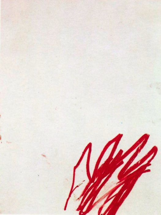
For textures, I kind of want them to mirror a Cy Twombly drawing, very messy and off center. You’ll have to use your imagination here.
Truthfully, I don’t even think they would do an ad campaign, but here’s a small design (picture it in the pages of Vogue):

Anyway, let me know what you think! The Row is beloved by so many people because it defines chic. It’s so hard to try and re-make something that’s considered the epitome of elegance, but hopefully The Row lovers approve!
Hear me out - I'm a photographer, what if I shot this brief for fun?
So well explained & researched. Moodboards are dreamy.
Thank you for sharing this ♥