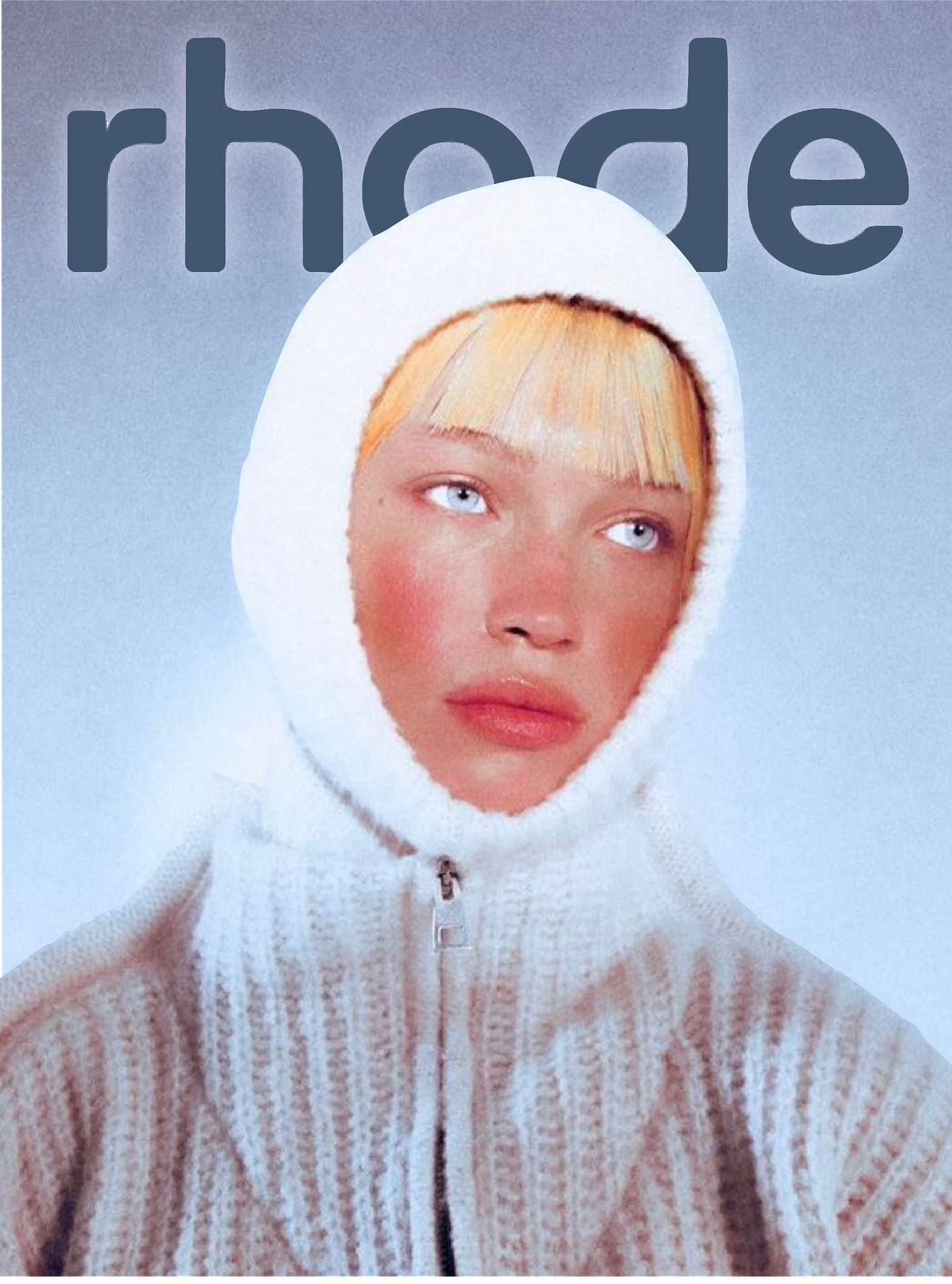
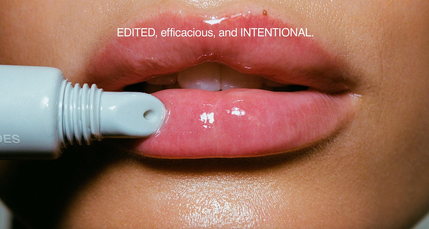
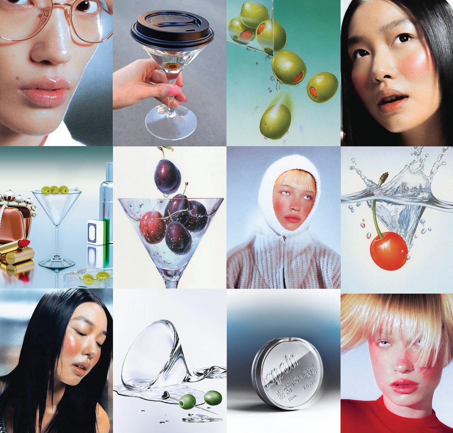
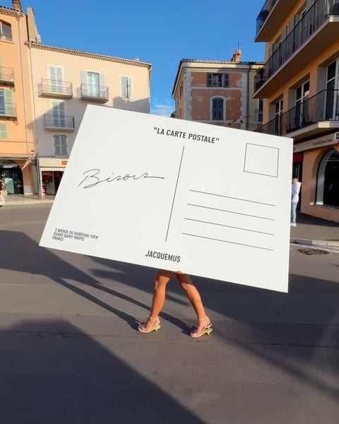
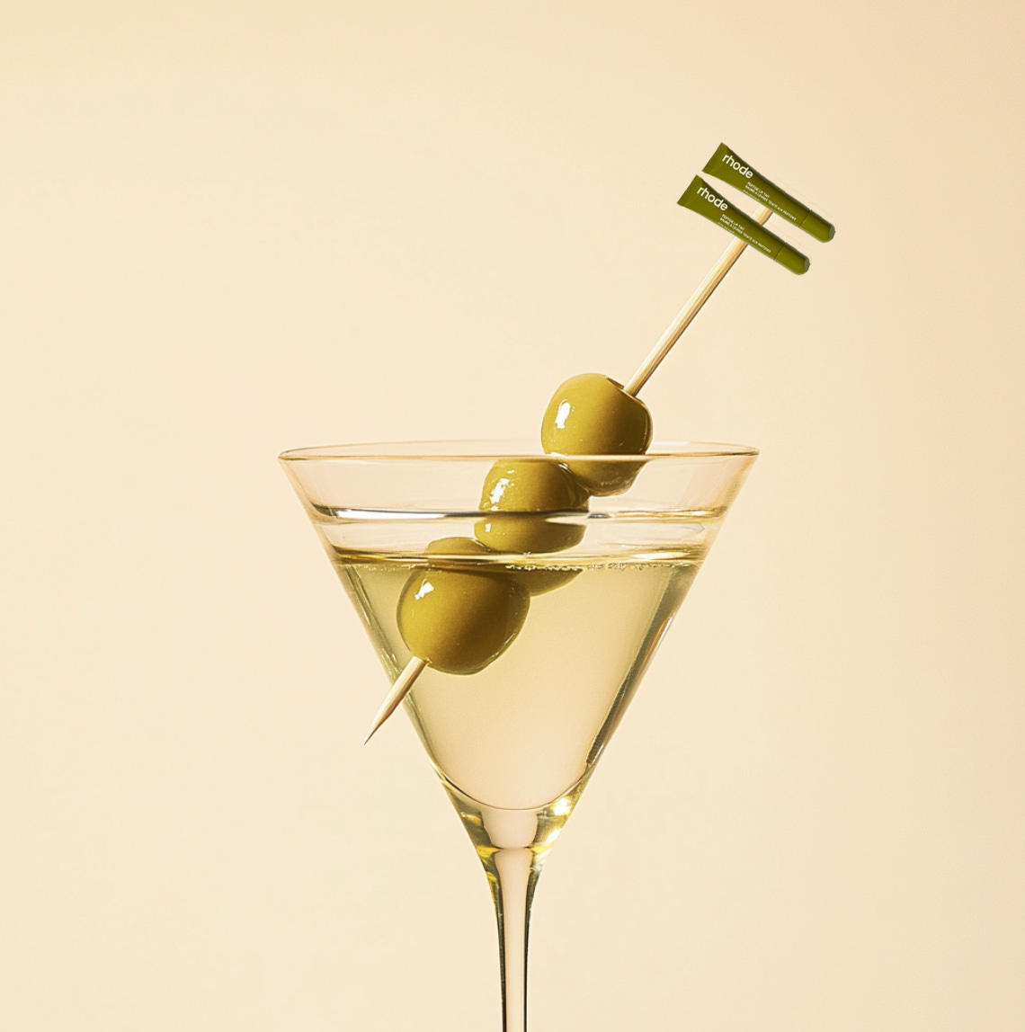
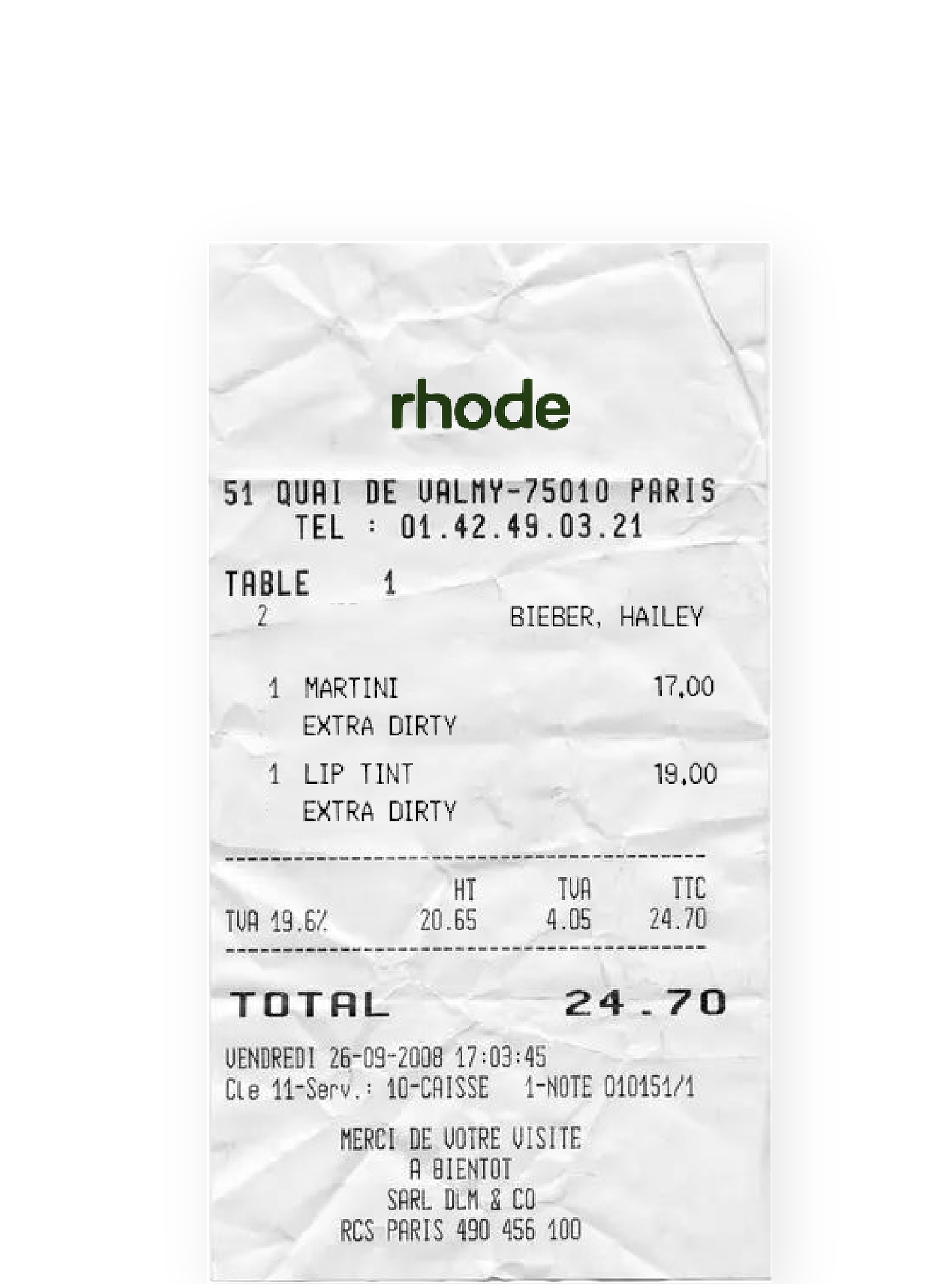
Disclaimer: This is a fantasy project! I made this campaign as if they had hired me to release their newest product, which I also made up. The only Rhode images are the first two. The rest are a mood board I made as my strategy.
Hello Hello Hello!
I’m happy to present all my new subscribers with another branding project! Today, we are talking about Hailey Bieber’s RHODE. A brand that I think has done a fantastic job entering the beauty realm alongside about a million others. And I don’t think it was all just celebrity star power. The designers behind Rhode are Chandelier Creative, an agency I’ve admired all my career.
It’s incredibly rare for a brand to spend adequate money on branding and then keep up the quality of the work. I have worked on TONS of brands that have spent hundreds of thousands on work from us, only to fall flat on execution. Or if we help deliver a great execution, it’s so rare that they keep it up. Thus, our portfolios suffer! I’m sure most art directors/designers/etc will agree.
Rhode is pretty much doing most things right (on the aesthetic side, I’ve actually never tried a product lol) and I want to show something I think would take it to the next level! Chandelier is producing gorgeous work for them and they’ve inspired me to ideate Rhode’s next campaign.
RHODE IS THE MOMENT
When I look through Rhode’s images, I can quickly ascertain where they gather their inspiration. They are very 90s-2000s, with their ombre grey backgrounds, chunky spy-kids-esque type. Everything looks Prada and Irving Penn. Beauty photography is so hard, because there are only so many ways to show off a tube of chapstick. The brand wants people to see a photo and think, “That’s Rhode,” while still doing something different in every campaign to keep people interested. I do believe Rhode has accomplished this in the majority of their photography, but not without recycling trends of the 90s & 2000s (which is inevitable). I’d like to bump them up a notch and do something I think will really standout.
MY RESEARCH
In my Rhode research, I looked into how Rhode described itself. Essentially, Rhode is about healthy skin, great formulation, and simple routines. “Intentional skincare” is their main principle. It shows in the AD. It looks semi-scientific, clean, effective, sharp, intentional. For some reason, things that are gray and silver read scientific LOL, so I hope you get me here. Sharp, high contrast, graphic shadows read efficient and intentional.
So now here’s where I come in. Now, I sincerely believe every shot should have strategy behind it besides just a coolness factor. When it comes to beauty, this becomes almost impossible when the brand also wants to appear unique. This article breaks it down more articulately than I can. For this particular campaign, I have to make some assumptions about a product I’ve never tried in order to be an effective storyteller.
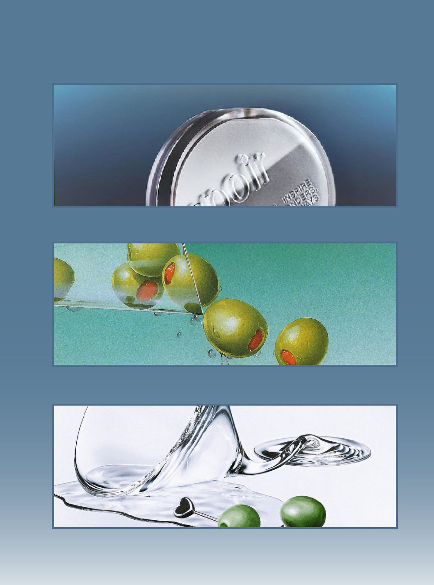
None of the below images are Rhode.
MY CAMPAIGN
In this fantasy, Rhode is releasing an OLIVE/MARTINI lip tint to go with their many trendy flavors, and have hired me. It’s very of the moment and it makes sense logically, since olive green fits with their brand colors well. I want them to bring back 80s airbrush advertising but in a sleek and modern way. I found a photographer that is essentially a fusion of their current aesthetic and 80s airbrush advertising and I think it would be a great combination.
My storytelling lies in this feeling: The icy cold coolness of drinking a martini. I have two ways of illustrating this coldness in the art direction.
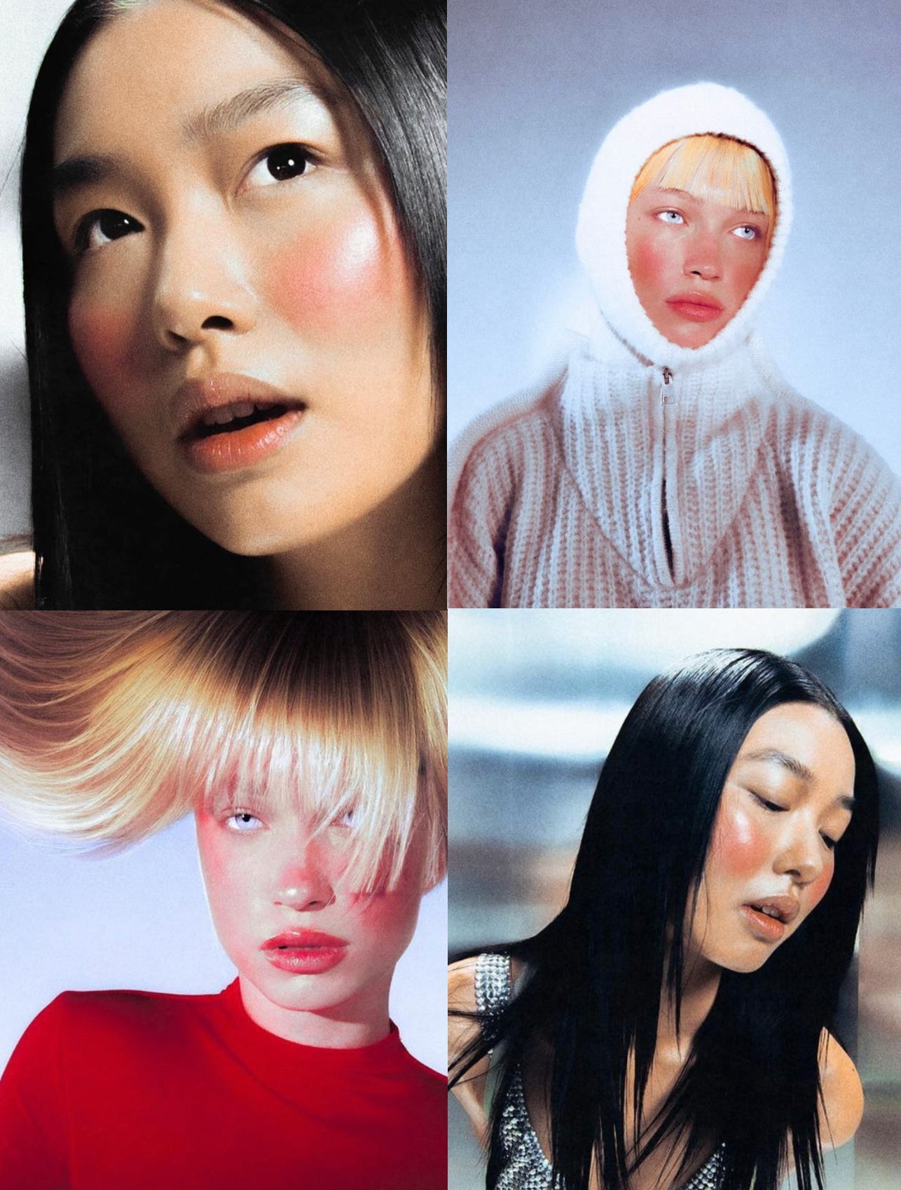
MODELS I want the photography to make you shiver! Jeremy Soma’s work does just that. The red cheeks, the grey backgrounds, the stick straight hair. It looks so sleek, yet vintage. It also looks like it could be a future photograph of Rhode, with its grey ombre backgrounds and Prada-esque lighting.
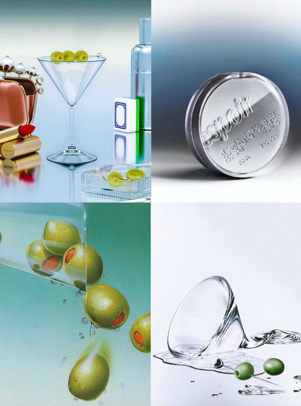
PRODUCT This is more abstract. I was thinking about how the condensation on the glass could alter a photograph with condensation on the lens. While that could be done, I thought about the liquifying effect of an airbrush tool. The airbrush has a fogginess to it, that looks a bit like condensation.
Along with this storytelling, I just think this is cool and will stop people from scrolling past. And its fun! I’m not here to say this look hasn’t been done before, but I think it fits nicely fits into Rhode’s aesthetic (gray backgrounds, ombre, clean, silver photography) and would be attractive for a campaign. I also think this is the next logical step in their aesthetic. Don’t make me explain myself!
THE ANNOUNCEMENT
How would they announce it? I think brand announcements should be short/sweet&silly. I like the idea of an artist making something ironic out of food, I like the nonsensical. Jacquemus always does this in such a cheeky way.
There are a lot of artists that they can pair with to do something really cool with olives or nails or something. Hanne Zaruma is one that stands out to me, as well as Gab Bois.
I really like Bobby Doherty’s work as well. And a collab with disco cubes would be cute!!
Some more ideas:
Olive picks with rhode lip glosses on the end
A mini egg carton to hold your olives
A play on the rhode phone case, a martini holder phone case?
THE SHOOT
As for the shoot itself, I want photos shot by Jeremy Soma in a freezing atmosphere. I love the red cheeks that make the photos seem so crispy.. I think his photography pairs really well with what I think the product shots should look like. Is this giving Kill Bill to anyone else?
I’d like the product shots to have that airbrush look that I’m talking about, whether it be from an actual airbrush or an illustrator. An artist I love is Julia Dufosse. I also love Haruko Hayakawa. I think the shots/illustrations should have a touch of surrealism, and more ombre backgrounds. Some of these drawings below are by the artist Masao Saito, popular in the 80s for his hyper-realistic illustrations. I’d like to emulate his style.
And as always, I’ll finish it off with some graphics:
There are so many fun directions to go with this, but I don’t want to go crazy. Let me know what you think!
I am hesitant to do more beauty branding posts like this (in case my work got used for free), and do something more fantastical, like branding for a pop star? Let me know if you would be interested in that. And if you think I’m crazy for posting this stuff for free. I never in a million years expected my Glossier post to get so much attention, I was really just doing this for fun. I know I can add a paywall, but I’d like to build a catalog first. Now that there’s a chance people could see my ideas and use them, should I keep them to myself? Do I really care that much?
Please share your thoughts and what you think creatives who love sharing their work should do…!







Like the Glossier post, I love this one too!!! There’s something magical about creatively dissecting brands and coming up with strategies. I think you should keep doing these but pop star would be just as cool!
As a content manager, I have dreams of working with an ad visionary like you! My industry is utilities, so wouldn't that be a fun abstract in this economy? ;) As far as protecting your work, I think a few more on some non-beauty topics and then move to teasers of a collage with the strategy behind the paywall.