Today, I’m doing a little thought exercise to keep me sharp while talking to a baby all day. And it’s about Glossier’s potential rebrand!
I was inspired by Remy Smidt of Atmosphere:
who thinks Glossier might be undergoing a major identity crisis. A brand that used to be for the girl next door has slowly morphed into everything else. How should it save itself?
She linked this reddit thread, in which the writer references Glossier’s newest summer drop and the addition of a bauhaus 70s style blocky logo. Along with new Gen Z colors, a lot of these posters believe that Glossier is moving in the wrong direction. I don’t disagree, as I personally hate the millennial-pink-to-gen-z-gender-neutral pipeline that all brands seem to participate in. The girls buying Glossier in 2016 are moms now (hello!), and they might feel foolish carrying around the same brand they did when they were 22. They graduate to more polished, chicer, luxe brands. As for Gen Z, they have far too much to choose from to suddenly jump on the Glossier bandwagon. I think Glossier would perform best with an “aged-up” rebrand so its millennial cult following will feel more at home. I also think it should lean into its American identity, for a multitude of reasons.
So, seeing as that I have spent a lot of my career in beauty branding, I’ve decided to do a quick rebrand of Glossier.
My Rebrand
~~~
Glossier has gotten some flack for copying “French girl beauty” with its minimalist, natural approach. I would like to see Glossier redefine “American girl beauty” a niche that has not quite been filled! Though they may deny it, Glossier is sort of a quintessential American brand, and it should lean that way.
What is quintessential American beauty? I’m going to ignore the past few decades because social media has really made the whole world into one globalist trend factory. When I picture American beauty, I picture Lauren Hutton, Cindy Crawford’s coke commercial, Farrah Fawcett in Nikes. It’s minimalist, joyful, bright, carefree. The whole vintage Americana thing is a bit overdone, so I am thinking of other ways a brand could look American.
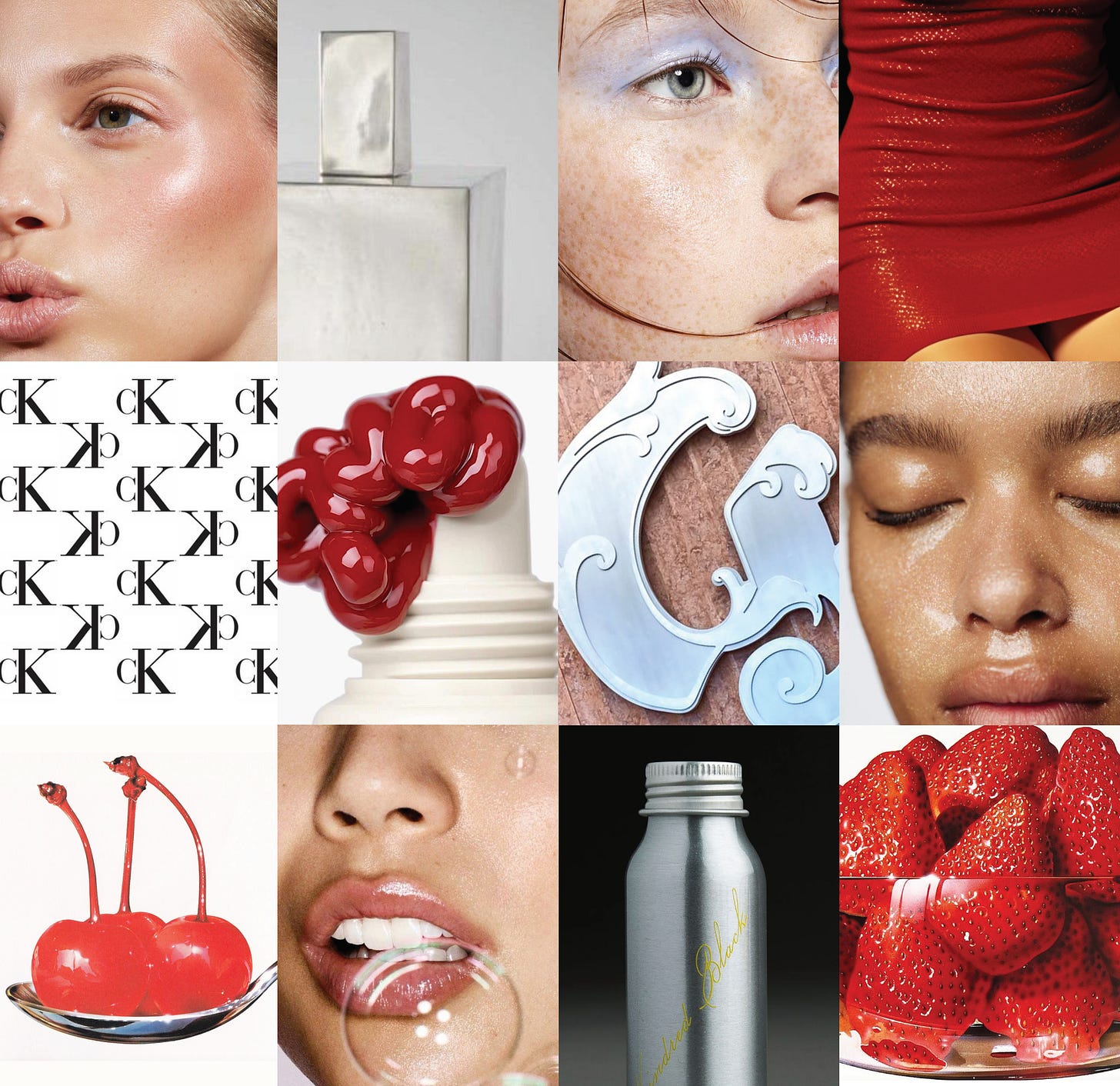
To me, American beauty is saturated, glossy but unpolished, visceral, realistic, bright. It’s vivid and detailed and imperfectly noisy but without filters. It’s also spontaneous and uninhibited. It’s provocative yet clean.
THE LOOK
~~
LOGO
I think the Glossier logo should not be changed, and I also love the calligraphic Glossier G. I do think we could fuss with the G a little, perhaps make a pattern out of it?
FONT
I don’t think there’s anything wrong with using Futura, classic fonts are classic for a reason. I do think it would be fun to add one serif-font in the mix, just for the tagline and some headlines. This can help the brand bring in that Americana I like so much, but while still feeling timeless and universal. This one is called Awesome Serif by Nicky Laatz.
COLOR
I still like the coquette-y pink, but I think it could be used more sparingly. I love the idea of leaning into the red, which I think is timeless, especially for makeup and America!
PHOTOGRAPHY/ART DIRECTION
Glossier became known for this specific lighting style in their photography, which I think was really cool and recognizable. Everyone knew a Glossier photograph when they saw it! But what really made Glossier photography so unique was the models. They had such an approachability to them, and it matched in their expressions. They always seemed mid conversation, or mid song, and not phony-looking teeth everywhere (like big commercial brands like Clinique). I think this candid, unreserved posing should remain a pillar of the Glossier brand. As for products, I love the idea of visceral, super vivid bright and saturated product photography revitalizing the brand. It is so hard to do something new and interesting when it comes to beauty photography, so unless the photography has purpose behind it, it will be hard to stand out. So although done before, this type of vivid and visceral photography will go hand-in-hand with the American messaging.
PACKAGING
I love the idea of silver/metal packaging for Glossier. It’s sustainable (metal is much better than plastic), and it would match the other packaging during a transitionary period. In order to keep the iconic pink, we could continue to use it in copy and logos. What if cloud paint looked like this? (I know its a shoddy photoshop job, but I ain’t getting paid!)
CAMPAIGN
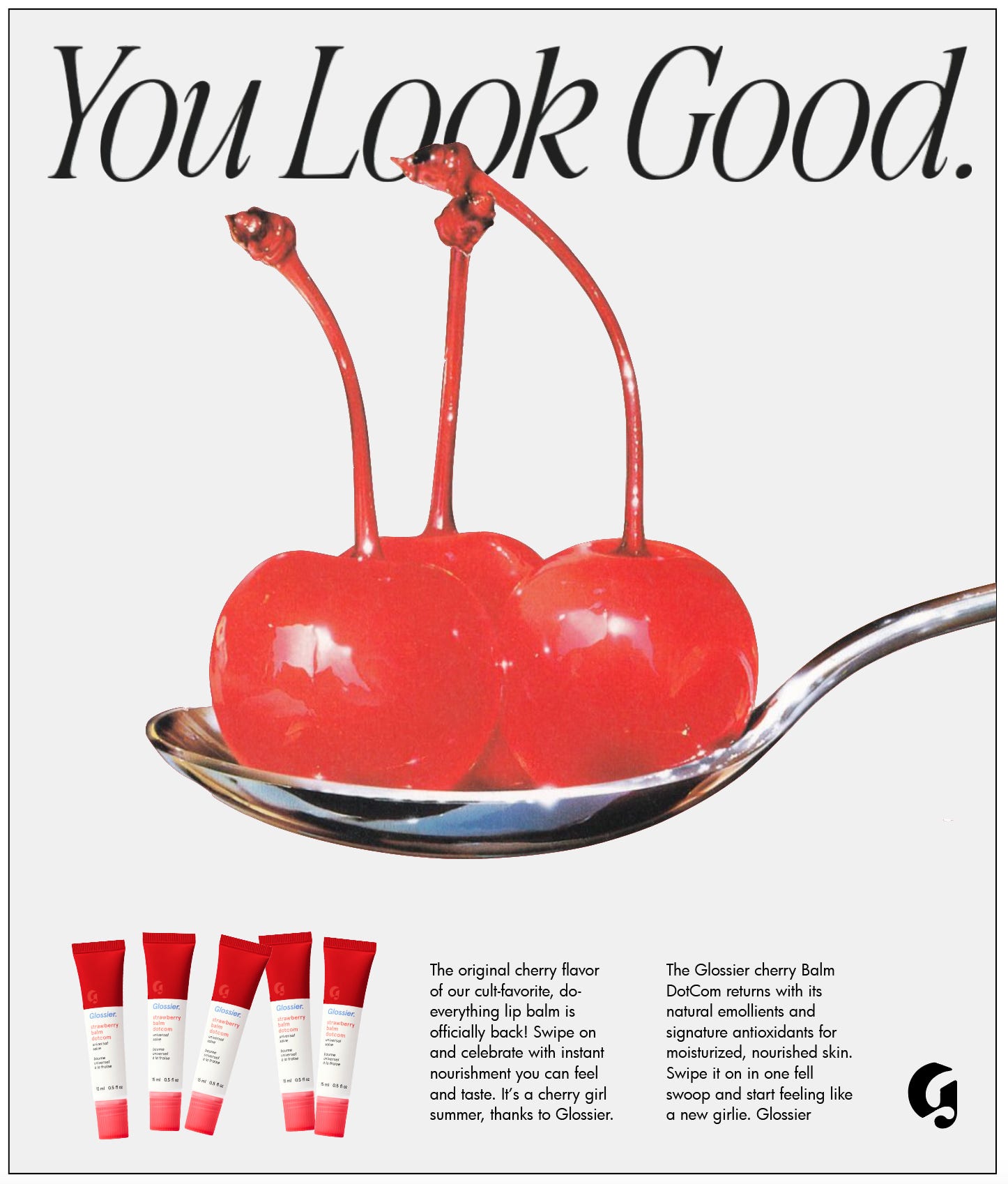
I made vintage style ads, because what’s more American than ads ads ads! I think the type makes it look a bit like an old Apple ad or something.
MERCH
It wouldn’t be Glossier without some goofy merch for influencers to peddle to us. Here are some ideas I got from LA-based brand Cherry + an LLbean tote for good measure:
That’s it! Let me know what you think or if you want me to further expand on this.
XOXOX


This is so much fun! American girl beauty (the girl next door kind, not the kardashian kind) is a great shout around an identity to lean into
This was so so good! I hope you do more of these takes on branding