


Rebranding Tiffany's

Hi everyone! I am doing my best to keep up with these but I tell you I am FRESH out of ideas. Slowly rebuilding the catalog at this point. Today I wanted to make way into the jewelry industry.
Like I say about every industry, Jewelry is HARD. Diamonds are great but who’s to say Tiffany diamonds aren’t the same as your Mr. McDiamond dealer down the block? They AREN’T. I, like most girls, did look at Tiffany for engagement ring inspiration, but would never truly purchase a ring from there. You are paying up for the brand, as I’m sure most of you know. And while there are plenty of gorgeous designs outside of engagement, they are either too recognizable to be chic (for Cartier, it’s the love bracelet, for Tiffany’s it might be that lock?), or they are too simple to pay the high price. My point BEING : branding is absolutely everything for a giant high-end commercial jeweler.
JEWELRY NOW
From what I can gather, high end jewelry that the millennial generation is wearing has mimicked the trends of interiors. The shapes have gotten more natural, more imperfect, more “earthy”. They feel more artistic and unique than the legacy brands. I think these brands are popular because women value the unique over the obvious. Unique and individual pieces have become the status symbol, instead of having something everyone else wants.

Some brands I referenced in my research: Hernan Herdez, Sophie Buhai, Sophie Bille Brahe, Erede, Juju Vera
The legacy brands (Tiffany’s, Van Cleef, Cartier, etc.) will never lose their reputation while they still have vaults of the most desirable jewels in the world. I will always enjoy seeing these jewels on a red carpet and I have no doubt that the rich older ladies still adore waltzing into these beautiful stores. But how can they ensure that younger generations respect their centuries-long reign?
For millennials getting older (and hopefully richer) I’m not sure if these brands are as desirable as they used to be. Have they become too recognizable, in a world where something recognizable can read as tacky?
TIFFANY’S NOW
I decided on this branding project because of a Pinterest ad I got of Tiffany’s. It was such a snooze I was almost surprised at the complete lack of creativity. I came across interesting little read, and was so glad someone was on the same page!

When looking at the Tiffany & Co instagram, it’s clear they lean a lot on celebrities. And while there is nothing wrong with that strategy, I don’t believe that is how you capture customers any longer. It helps them remain relevant, but not entirely desirable.
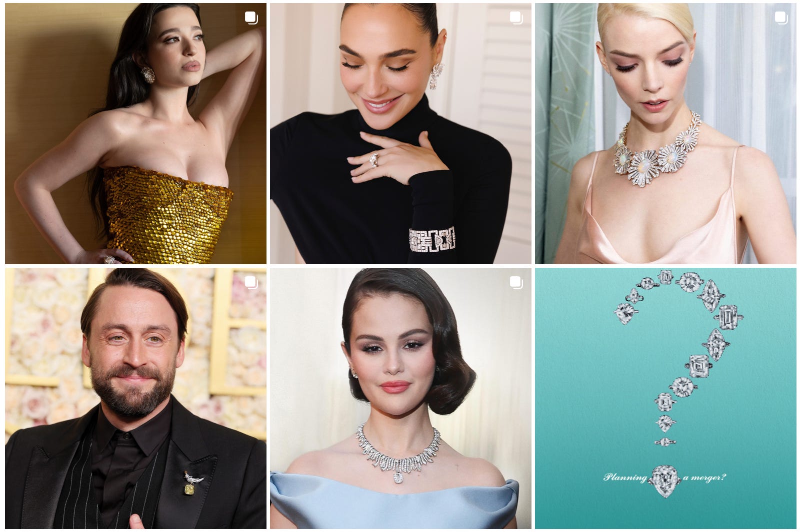
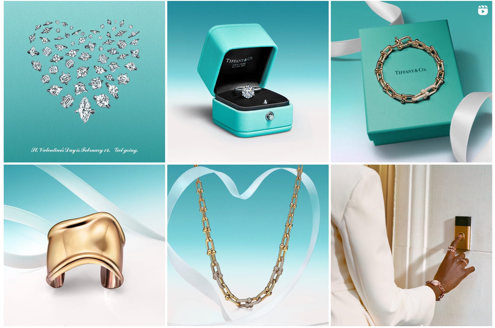
Their art direction is sleek, clean, and always blue. It reminds me of La Prairie or Swarovski. They are focusing on shiny & sleek, instead of artisan, heritage, classic.
MY PROCESS
I know people like to learn a little bit more about my process so I’ve decided to share a very rough one here.
When we are talking about a legacy brand, it helps to do a couple things.
Write down all associations you can think of - any words! Notice how random mine are - the Titanic LOL. Also do not use the internet when you do this. You can circle the words that go together, draw shapes that associate with the words, or just single out one word. I honestly just use this to get all my words out, it usually is just a dumping ground.

Dip into their archives - old ads, photography, product. And look into similar brand’s archives. You could even ask your mom! Going back to a brands roots is almost always a good idea.


A few ideas really stood out to me after thinking through this process. There is a sort of feminine power angle (dare I say…..girlboss…) with menswear silhouettes and the idea of buying jewelry for yourself, not letting someone gift it to you. This didn’t quite work for me because it felt narrow, but could definitely work as a campaign.
There was an idea for excess, a Marie Antoinette-style shoot that borrowed references from any era of royalty and excess (from Marie to Gatsby). This one didn’t really pan out because it didn’t feel very Tiffany’s. I don’t believe they are a brand of excess, more so ONE of their pieces should be the only one you need to put on.
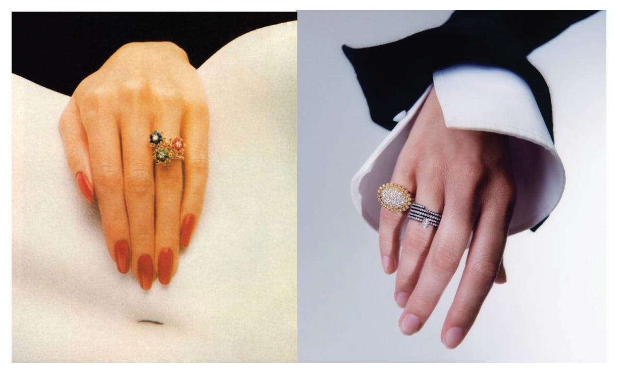
As for returning to the brand’s roots, I think this is almost always a good idea. Because Juju Vera clearly references old Tiffany/Cartier/Van Cleef ads in their imagery, I didn’t want to go complete down this road (I’ll explain later). They do it with a 60s tilt and a European spin.

Juju Vera is a relatively new brand, but they’re borrowing the imagery of long ago to make us think they’ve been around forever. But, Tiffany’s actually has been around forever, so I can do this even more authentically.
BUT, I don’t think it’s that simple. 200 years of history looks completely different pretty much every decade. Tiffany’s lived through WORLD WARS…. So what is the best way to go about this? Should we bring back the Tiffany ads of the past? Or do we find a way to diffuse the sleekness, embrace the femininity, while also reminiscing on amazing accomplishments of this jewelry giant?
Images linked on my Pinterest.
THE MOODBOARD
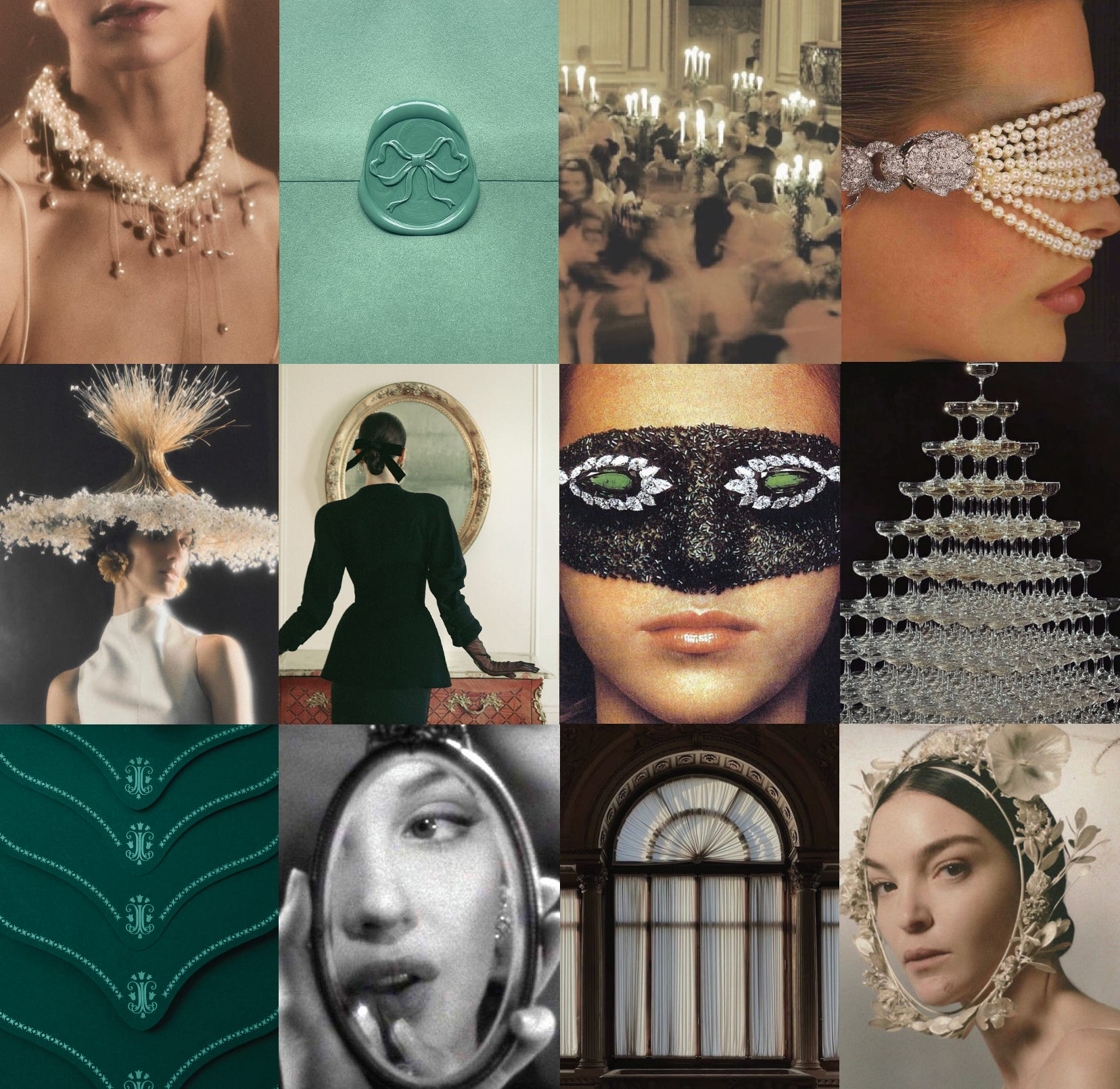
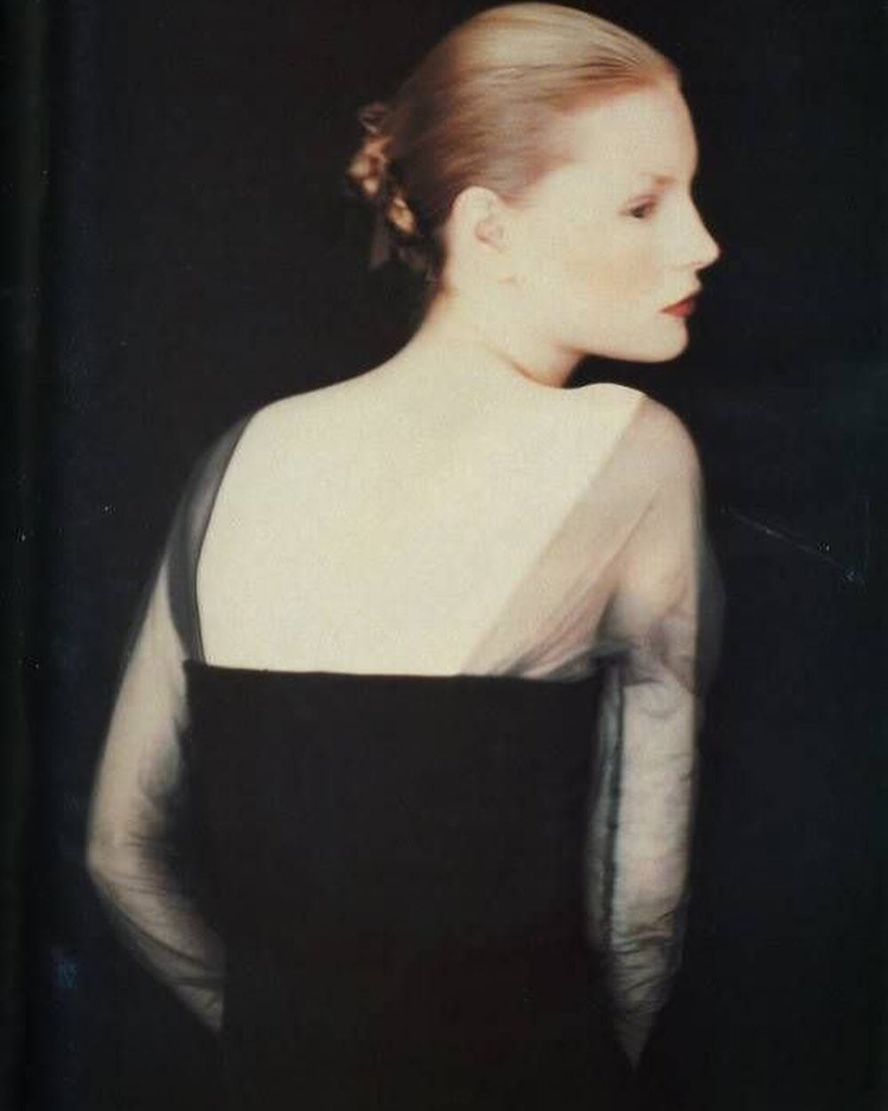
I decided to reference the glorious gilded age. This era references a time of longevity, enduring craftsmanship, prestige, and exclusivity. The establishment of timeless credibility. And while things looking “old” is very in right now, I am not going to photoshop a magazine ad to make the paper look crusty. I’d rather reference the magical past of Tiffany’s through photography techniques and color, while reminding consumers of the brand’s modernity in unexpected ways.
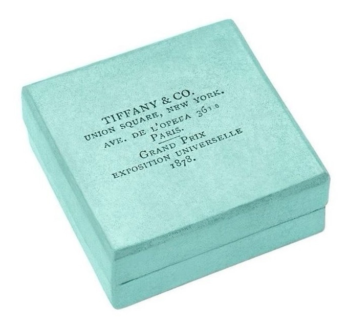
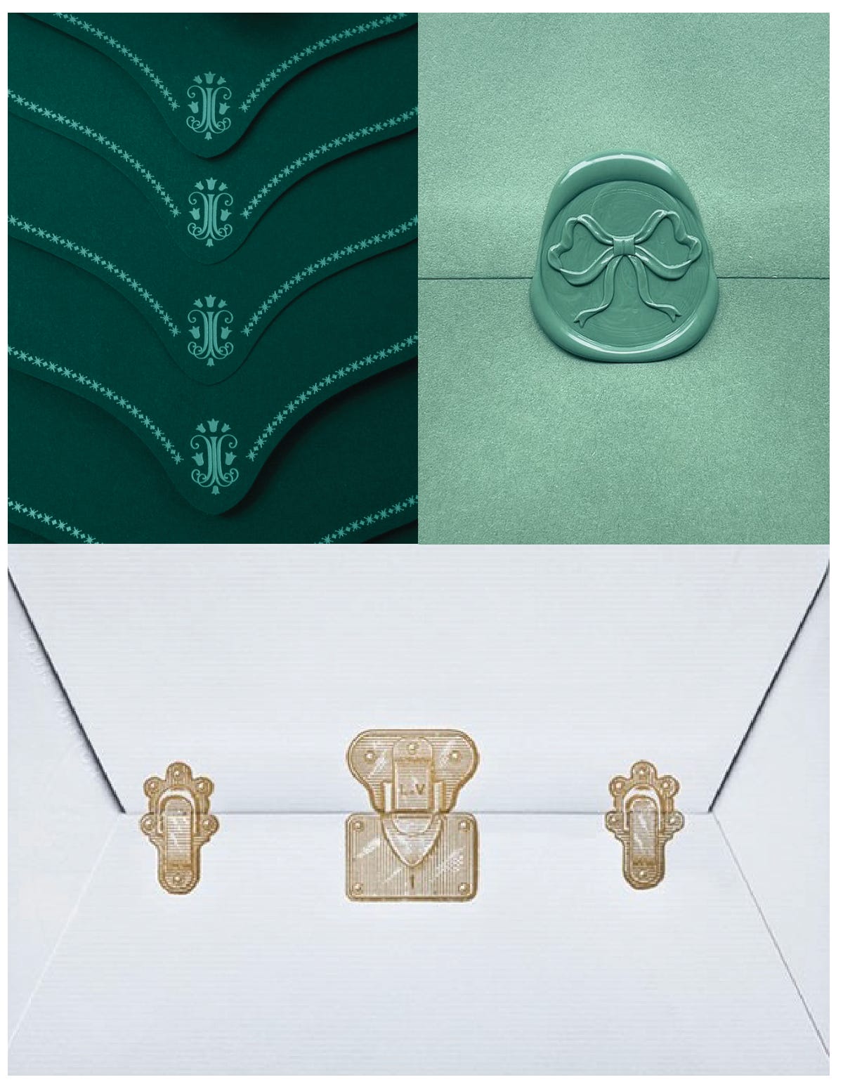
PACKAGING
In order to make this realistic, I would not change the blue box. I would probably bring in a blue box of the past to change up the current brand’s minimalism, but the simple blue box would not go away. In order for Tiffany to move towards current trends, they’ll need to show more craftsmanship in their packaging, like they do in their jewelry. Packaging is half the fun! Here are some ideas for packaging accoutrements - some stamps, embossing, more intricate designs.
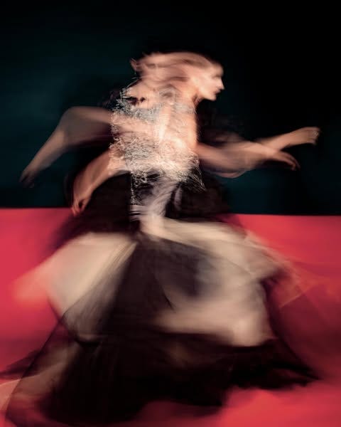
PHOTOGRAPHY

LIGHTING
I am picturing this cinematic, old-world lighting. Images that look like they’re in your dreams, or a deep distant memory. The highlights are delicate, the shadows are soft, and I’m reminded of the Kira Kira app (lol) to enhance the sparkle. I am hoping to make the images feel both historic and futuristic at the same time, given the context. The backgrounds have this mottled/dappled (?) look to them that feels apt.
STYLING
I like the idea of bringing back the masquerade parties of the New York gilded age, set in a gilded age mansion. The styling would be tight and prim, with hair coiffed and tied back appropriately. I love the ideas of models with masks made of jewels on their eyes!
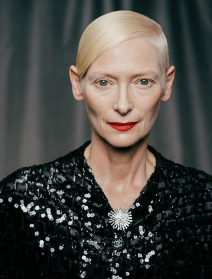
MODELS
Definitely some older models. I strictly read books about society ladies in New York from the 1800s on. Seeing as Tiffany’s is an aspirational brand, THAT is who will make me buy it. Should we get Tilda Swinton as the face?

PHOTOGRAPHERS
It is hard to find photographers with the look I’m describing, but Stas Komarovski is one of them. Same as Sonya Mazuryk. This has to be someone who can master that technique I described but with a very sharp modern twist. Paul Kooiker is another great option.
GRAPHICS
Then we put it all together! Often the more luxurious the brand, the less I use graphics. The images should really speak for themselves. In this instance, I actually think we need a tiny bit of dressing up! Let the images breathe, but consider adding some graphics in other places.

If you like my work and want to support, please consider donating via Ko-Fi!
I have no plans to make my substack paywalled in the near future and hope to continue sharing my work with all of you. XO
Drop your 1800s NY society ladies reading recs! (I, too, am endlessly entertained by this era)
Absolutely in love with this!!!!